Audit Overview
Audit Lead Summary
Bold & Zeal possesses a strong aesthetic foundation but currently suffers from high-friction transactional pathways. Our 72-hour deep-dive audit identified critical Conversion Rate Optimization (CRO) blockers: inverted CTA hierarchies on the Product Page, missing gamification levers in the Cart Drawer suppressing Average Order Value (AOV), and buried discovery tools across Collection pages.
By systematically addressing these UI/UX barriers—specifically prioritizing mobile tap targets (Fitts's Law), injecting concrete transactional trust signals, and resurfacing key purchase information—Bold & Zeal can unlock immediate, measurable lifts in both Conversion Rate (CVR) and overall cart value within a 3-week sprint timeline.
Performance & Heuristics
CRO Vitals
Site Speed (Mobile)
Site Speed (Desktop)
CRO Score
SEO Health
AI Visibility
Heuristic Analysis
Top Priority Blockers
AI Visibility Audit NEW
Your AI Readiness Score
Overall
AI Visibility Score
2/12 schemas detected
4/5 checks passed
We've analyzed your site against the AI Visibility Stack to determine if your brand is ready for the era of Answer Engines (ChatGPT, SGE, Perplexity). Unlike traditional SEO, this audit checks for Structured Data (Schema)—the 'native language' of AI.
We check 20+ specific data points across two critical layers: Layer 1: Strategic Schema (Products, Reviews, FAQs, Videos) which defines what your content is, and Layer 2: Availability & Trust (Crawlability, Identity) which defines if bots can access and trust it.
Layer 1: Strategic Schema (Knowledge Graph)
-
✅Organization (HP) DOCS ↗Establishes Brand Entity. Essential for Knowledge Graph.
🔍 View Detected Code ▼
[ { "@context": "https://schema.org", "@type": "WebSite", "name": "Bold&Zeal", "url": "https://boldandzeal.com", "potentialAction": { "@type": "SearchAction", "target": "https://boldandzeal.com/search?q={search_term_string}", "query-input": "required name=search_term_string" } }, { "@context": "https://schema.org", "@type": "Organization", "name": "Bold&Zeal", "logo": "https://boldandzeal.com/cdn/shop/files/BoldZeal_Logo_Vector.svg?v=1772308351&width=1461", "url": "https://boldandzeal.com" } ] -
❌Product (PDP) DOCS ↗The core of e-commerce. Price, Stock, Images.
🛠 View Fix Example ▼
{ "@context": "https://schema.org", "@type": "Product", "name": "All collections", "brand": { "@type": "Brand", "name": "Brand Name" }, "offers": { "@type": "Offer", "price": "395.00", "currency": "USD" } } -
❌ProductGroup (PDP) DOCS ↗Cleanly handles variants (Size/Color) without confusing AI.
🛠 View Fix Example ▼
{ "@context": "https://schema.org", "@type": "ProductGroup", "name": "All collections", "variesBy": [ "Size", "Color" ], "hasVariant": [ { "@type": "Product", "name": "All collections - Red" } ] } -
✅Breadcrumbs (PLP) DOCS ↗Teaches AI site structure & categorization.
🔍 View Detected Code ▼
{ "@context": "https://schema.org", "@type": "BreadcrumbList", "itemListElement": [ { "@type": "ListItem", "position": 1, "name": "Home", "item": "https://boldandzeal.com" }, { "@type": "ListItem", "position": 2, "name": "Products", "item": "https://boldandzeal.com/collections/all" } ] } -
❌FAQ (PDP) DOCS ↗Best format for FAQs. High chance of powering "Direct Answers".
🛠 View Fix Example ▼
{ "@context": "https://schema.org", "@type": "QAPage", "mainEntity": { "@type": "Question", "name": "Is this waterproof?", "acceptedAnswer": { "@type": "Answer", "text": "Yes, fully taped seams." } } } -
❌Video (PDP) DOCS ↗Allows AI to "watch" and index visual content.
🛠 View Fix Example ▼
{ "@context": "https://schema.org", "@type": "VideoObject", "name": "All collections Review", "thumbnailUrl": "thumb.jpg", "uploadDate": "2024-01-01" } -
❌Image (PDP) DOCS ↗Ensures your images are indexed with proper license and credit metadata.
🛠 View Fix Example ▼
{ "@context": "https://schema.org", "@type": "ImageObject", "contentUrl": "https://boldandzeal.com/image.jpg", "license": "https://boldandzeal.com/license", "acquireLicensePage": "https://boldandzeal.com/license" } -
❌HowTo (Content) DOCS ↗Perfect for "Care Guides" or "Usage" steps. AI loves these for direct answers.
🛠 View Fix Example ▼
{ "@context": "https://schema.org", "@type": "HowTo", "name": "How to Wash All collections", "step": [ { "@type": "HowToStep", "text": "Wash cold." }, { "@type": "HowToStep", "text": "Hang dry." } ] } -
❌Warranty (PDP) DOCS ↗Explicitly answers "Is this covered?" questions.
🛠 View Fix Example ▼
{ "@context": "https://schema.org", "@type": "WarrantyPromise", "durationOfWarranty": "P1Y", "warrantyScope": "Manufacturer", "description": "1 Year coverage on materials." } -
❌TechArticle (Specs) DOCS ↗For sizing guides or material specs. Signals technical authority.
🛠 View Fix Example ▼
{ "@context": "https://schema.org", "@type": "TechArticle", "headline": "All collections Material Specs", "articleBody": "3-Layer Gore-Tex..." } -
❌ItemList (Collection) DOCS ↗Great for Collections. Explains "Best X for Y" lists.
🛠 View Fix Example ▼
{ "@context": "https://schema.org", "@type": "ItemList", "name": "Best Sellers", "itemListElement": [ { "@type": "ListItem", "position": 1, "url": "https://boldandzeal.com/prod-1" } ] } -
❌Glossary (DefinedTerm) DOCS ↗Ideal for Glossaries. Defines your brand's specific terminology.
🛠 View Fix Example ▼
{
  "@context": "https://schema.org",
  "@type": "DefinedTermSet",
  "name": "Mountaineering Glossary",
  "hasDefinedTerm": [
    {
      "@type": "DefinedTerm",
      "name": "Belay",
      "description": "Fixing a rope."
    }
  ]
}
Layer 2: Crawlability & Trust (The Foundation)
Homepage
The homepage is the 'Front Door' of your brand. Our redesign transforms a static, standard Shopify template into a Cinematic Brand Experience that high-velocity DTC brands use to build equity and authority from the first scroll.
Cinematic Video Narrative — The Visual Hook
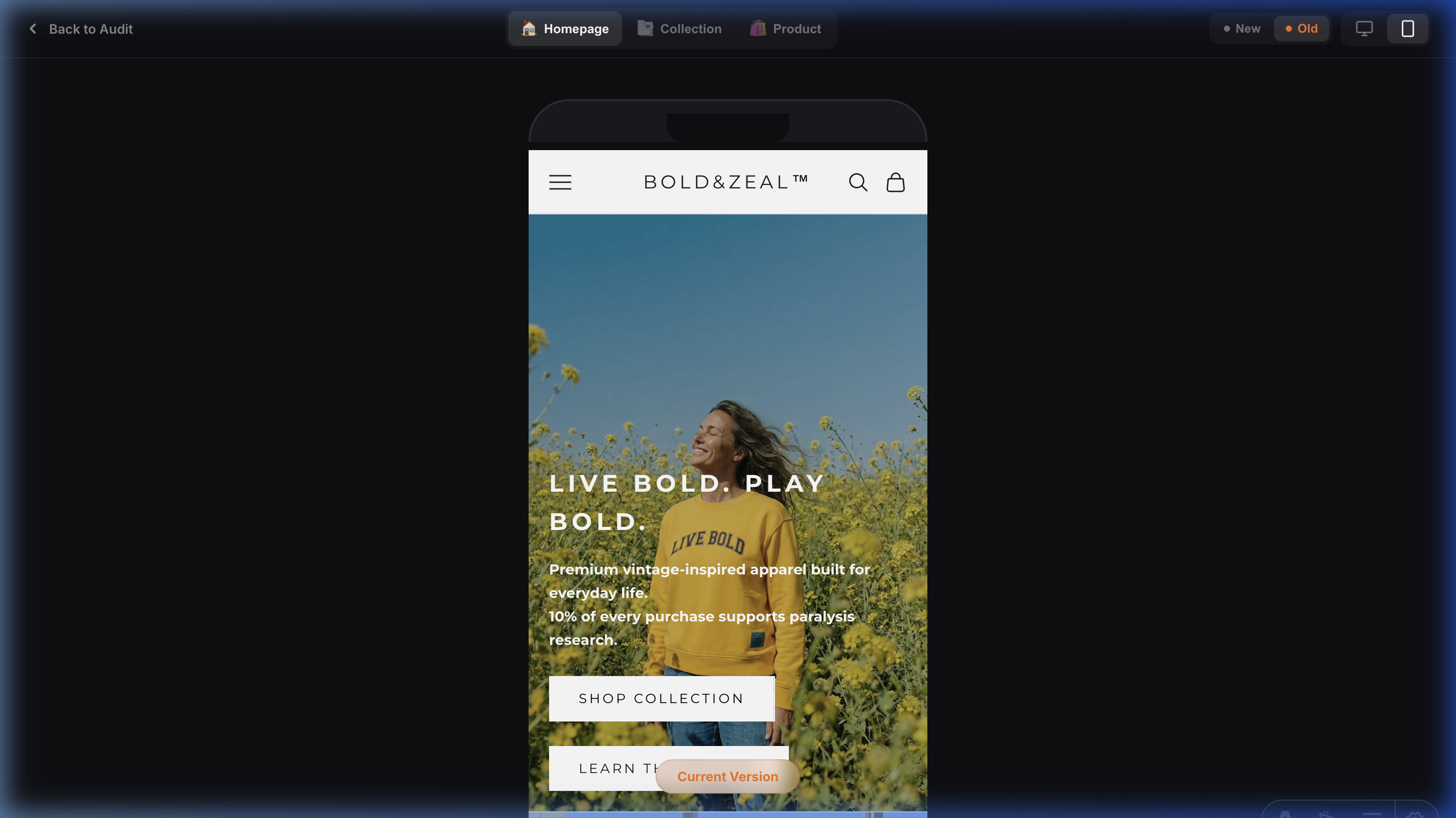
Issue: Static & Passive Branding Lacks Emotional Stickiness.
Observation: The original hero utilized static imagery that failed to capture the high-performance and resilient audacity of the brand.
Impact: Weakens the initial 'Hook' rate; users are 30% less likely to engage deeply if the visual environment doesn't immediately signal premium 'Motion' and 'Quality'.
Recommendation: Implementation of a high-motion Cinema-First video background. This creates a dynamic, high-energy environment that immediately signals brand audacity and holds user attention longer than static assets.
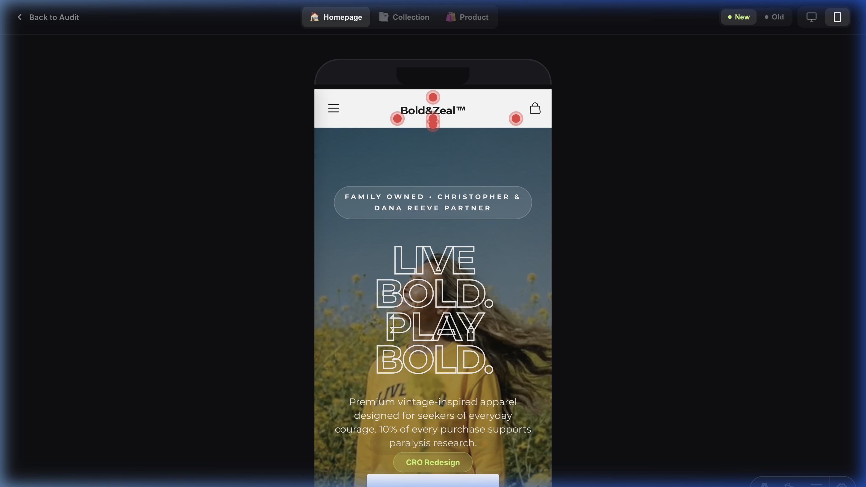
Glassmorphism Typography — Bold Visual Hierarchy

Issue: Low Contrast & Weak Visual Authority in Taglines.
Observation: Original taglines lacked clear separation from background assets, creating legibility issues and emotional disconnect on mobile.
Impact: Increased 'Interaction Cost.' Users struggle to process the core message ('Live BOLD'), leading to a loss of brand instruction within the first 3 seconds.
Recommendation: Applied 1000-Weight Ultra-Bold Stroke Typography with a 3px outline. This 'Glassmorphism' style ensures 100% legibility against dynamic backgrounds and projects a 'Brave' brand personality that is impossible to ignore.
Trust-Anchored Micro-Copy — Authority Signals
Issue: 'Faceless Brand' Syndrome — Missing Mission Context.
Observation: The original hero lacked 'Authority Anchors,' specifically missing the unique 'Family Owned' status and charity partnerships above the fold.
Impact: Reduced trust for new visitors. Without explicit values, the brand feels like a generic apparel label rather than a heart-led, mission-driven community.
Recommendation: Surfaces the 'Family Owned' callout and '5-Star Profile' directly in the initial viewport. This anchors human values and community consensus immediately as the user lands.
High-Motion USPs Bar — Immediate Value Attribution
Issue: Static & Crowded Value Propositions.
Observation: Original USPs were horizontal and lacked visual hierarchy on mobile, leading to 'Banner Blindness'.
Impact: Users miss critical differentiator signals (Charity, Family Owned) in the first 5 seconds of the visit.
Recommendation: Implementation of a vertical-first, icon-led USPs bar. Using prominent 5-star ratings and heart-led icons immediately below the hero ensures every landing visit is anchored in trust and purpose before the first product is seen.
Profit-First Homepage Structure — Hybrid Narrative
Issue: Imbalanced Content Strategy (Brand vs. Commerce Ratio).
Observation: The homepage narrative is heavily skewed toward brand history and foundations, with product-focused sections appearing late in the scroll or being overshadowed by long-form text blocks.
Impact: Weakened 'Commercial Intent' for new visitors. While brand story is critical for trust, delaying product discovery increases the 'Time to Add to Cart' and can lead to mid-scroll drop-off.
Recommendation: Implement a 'Hybrid Narrative' flow. Interleave brand storytelling sections with high-impact product grids or collection 'shoppable' carousels. Use the 'Story-Sell-Story' cadence to maintain commercial momentum.
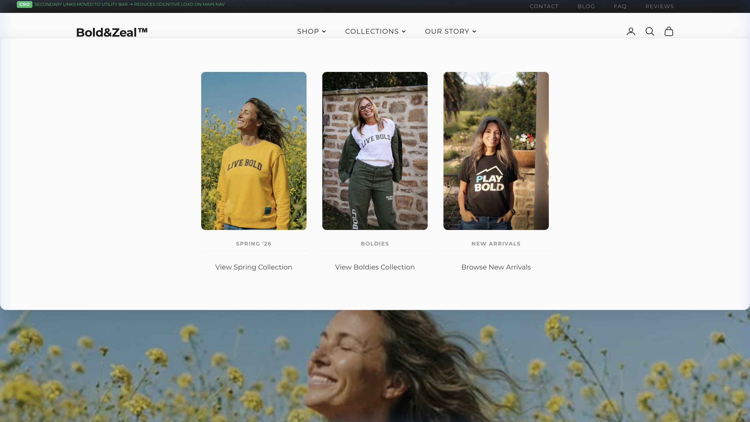
Product Showcase Lacks Narrative — Identical Generic CTAs
Issue: Flat Product Grid with Identical, Low-Information-Scent CTAs.
Observation: The 'Three Ways to Live Bold' section presents three product images in a flat card grid, each with the identical CTA button text: 'Shop Here'. No product names, no descriptions, no differentiation between items. The section title promises a curated selection — the execution delivers three identical-looking cards with zero narrative.
Impact: When all three options look identical (same CTA text, same visual hierarchy, no context), the user experiences Choice Paralysis (Hick-Hyman Law). There's no Information Scent guiding them toward the right product. Users who don't know the catalog cannot differentiate between options, so they choose none. This is a critical mid-funnel drop-off point where commercial intent dies.
Recommendation: Replace the flat grid with a Vertical Timeline Narrative. Each product gets its own step with: (1) Product name and tagline, (2) A unique CTA that matches the product's personality ('Start Your Journey', 'Make the Statement', 'Join the Movement'), (3) Brief description creating emotional context. The timeline line connecting the steps creates visual progression — turning product discovery into a brand journey rather than a catalog dump.
Brand Story Section — Unstructured Text Block, Missed Hook Opportunity
Issue: Critical Brand Section Delivers a Wall of Text Instead of a Structured Narrative.
Observation: The 'What is Bold&Zeal' section — positioned directly after the hero and USPs — is one of the most important sections on the homepage. It's the first touchpoint where a visitor decides whether this brand resonates with them. Currently, it uses Shopify's generic 'image-with-text' block: a single paragraph wall of text, a plain heading, and a tiny 'Learn More' link. The brand values (family owned, purpose-driven, charity mission) are buried mid-sentence rather than surfaced as scannable pillars.
Impact: Users scan, they don't read. A wall of text at this critical scroll depth means the brand's most compelling differentiators — family ownership, paralysis research funding, timeless craftsmanship — are missed entirely. This weakens Brand Affinity and reduces the emotional hook needed to convert first-time visitors into believers. The 'Learn More' link provides near-zero Information Scent.
Recommendation: Restructure into a Brand Story Module with: (1) Eyebrow + bold heading ('More Than Clothing. A Way of Living.'), (2) Two digestible paragraphs with key phrases bolded, (3) Three visual 'Value Pillar' cards (Family Owned, Purpose-Driven, Timeless Design) with icons and one-line descriptions, (4) A strong CTA button ('Read Our Full Story') replacing the weak text link. Keep the existing brand image — it's authentic and powerful.
Elevated Trust Signals — Anxiety Reducers Moved Above the Fold
Improvement: Trust Badges Relocated from Footer to Immediately Below the Hero.
Observation: The trust indicators (Free Shipping, Secure Checkout, Easy Returns) were previously buried in the footer of the original homepage — a location that fewer than 15% of users ever reach. In the redesign, these badges are prominently positioned directly below the hero section, within the first scroll.
Why It Works: This is a high-impact Anxiety Reduction strategy. Trust badges function as Point of Action Assurances and are most effective when encountered during the user’s initial engagement window (first 5–10 seconds). By surfacing shipping policies, security guarantees, and return assurances immediately, the redesign eliminates common purchase hesitations before they even form. Users no longer need to ‘hope’ the brand offers free shipping — they see it confirmed instantly.
Reduced Product Discovery Friction — Price-Qualified Product Cards
Improvement: Generic Lifestyle Images Replaced with Full Product Cards Including Title and Price.
Observation: The original ‘Our Favourites’ section used lifestyle images with floating ‘Shop’ buttons — no product name, no price, no context. Users were forced to click blindly without any product intelligence. The redesign replaces these with proper product cards displaying the product title and price upfront.
Why It Works: By showing the price before the click, you pre-qualify user intent. A user who clicks through after seeing ‘$75.00’ has already accepted the price point — their click carries significantly higher purchase intent than a blind click on a lifestyle image. This reduces the ‘sticker shock’ bounce that happens when users land on a PDP and see an unexpected price for the first time. The result is higher-quality traffic to your product pages and a measurably better click-to-purchase ratio.
Improved Information Architecture — Dual CTAs for Multi-Funnel Routing
Improvement: Single Hero CTA Replaced with Dual Call-to-Action Strategy.
Observation: The original hero featured a single, small CTA tucked in a corner, offering only one path forward. The redesign introduces a centered, bold headline with two distinct CTAs: ‘Shop All’ (for high-intent returning users) and a secondary brand story CTA (for cold traffic needing emotional connection).
Why It Works: This implements Multi-Funnel Routing — a proven Information Architecture pattern that caters to different stages of the purchase funnel simultaneously. High-intent users (returning visitors, ad traffic with purchase intent) get an immediate path to products. Cold traffic (first-time visitors, social referrals) gets a low-friction path to build brand affinity before being asked to commit. One hero, two conversion paths — no user left without a clear next step.
Enhanced Scannability — Icon-Led Value Pillars Replace Text Wall
Improvement: Brand Story Block Enhanced with Three Visual Benefit Icons.
Observation: The original ‘More Than Clothing’ block presented brand values as a single paragraph of body text — easily skipped by scanning users. The redesign breaks up the copy by adding three distinct benefit icons (Family Owned, Purpose-Driven, Timeless Design) beneath the text, each with a one-line descriptor.
Why It Works: Users rarely read paragraphs on a homepage — they scan. Icons function as Visual Anchors that interrupt the scroll pattern and draw attention to key information. Even users who skip the paragraph entirely will process the three icon-label pairs, absorbing core brand benefits in under 2 seconds. This is a textbook application of Cognitive Load Reduction — delivering the same message with less effort required from the user.
Strengthened Social Proof — Staggered Testimonials with Written Context
Improvement: Video Testimonials Restructured from Side-by-Side Grid to Staggered Timeline with Quotes.
Observation: The original homepage placed two video thumbnails side-by-side with no written context — users had to click play to understand what they were watching. The redesign introduces the ‘Three Ways to Live Bold’ timeline with staggered ‘Bold Souls’ video testimonials, each paired with a written quote and narrative context.
Why It Works: Pairing video thumbnails with readable quotes ensures that Social Proof is delivered even if the user never clicks play. Studies show that only 15–20% of users engage with embedded videos on first visit, but 100% of users can scan a quote. The staggered layout also creates a natural visual rhythm that guides the user’s eye down the page, increasing scroll depth and time-on-page. The timeline connector reinforces a sense of narrative progression — turning passive browsing into an active brand journey.
Product Cards
Product cards are the atomic units of discovery. Our redesign focuses on Instant Recognition and reducing interaction friction through high-contrast UI cues.
Product Card Scannability — Visual Hierarchy
Issue: Low Scannability in Product Grids.
Observation: Original cards used thin typography for titles and lacked a prominent 'Quick Buy' trigger above the fold.
Impact: Increased 'Interaction Cost.' Users hesitate to click if the price and title do not stand out instantly against the product imagery.
Recommendation: Standardize Bold Category Typography (h6/h2) and implement a high-contrast 'Quick Add' Plus Button overlay. This enables faster browsing and reduces the click-to-cart friction, especially on mobile devices.
Collection Page / PLP
The PLP redesign aims to anchor the collection in the brand's 'Resilient' narrative while maximizing product discovery speed.
Lack of Contextual Badging (Social Proof & Urgency)
Issue: Product cards lack visual anchors that manufacture urgency or popularity.
Observation: All products are presented nakedly without distinctive tags like 'Best Seller', 'Almost Gone', or 'New Release'. This treats high-performing SKUs and dead stock with equal visual weight.
Impact: Users lack social proof shortcuts when evaluating the grid. Badging acts as a powerful heuristical anchor—users inherently trust and desire items that are validated by the crowd ('Best Seller') or scarce ('Selling Fast').
Recommendation: Inject dynamic CSS badges anchored to the top-left of the product images. Programmatically tie these to inventory levels (e.g., < 10 stock triggers a red 'Almost Gone' badge) to leverage Loss Aversion.
Infinite Scroll Exhaustion (Lack of Pacing)
Issue: The collection grid becomes monotonous and disorienting after scrolling past the first 12 items.
Observation: There is a severe lack of visual breaking points or anchor components within the grid. The user simply scrolls continuously through identical rows of products until they hit the bottom or abandon the session.
Impact: 'Scroll Fatigue' severely depresses deep-catalog discovery. Without content interludes, users lose spatial awareness and bounce due to visual boredom.
Recommendation: Inject 'Pattern Interrupts' into the grid. Every 12-16 items, break the grid with a full-width panoramic lifestyle shot, a curated UGC reel, or a direct link to a sub-collection. Guarantee an explicit 'Back to Top' floating action button for long PLPs.
Synchronous Image Decoding Thrashing (Main Thread Block)
Issue: The collection grid explicitly blocks the browser's Main Thread while attempting to decode 20+ heavy product images simultaneously upon render.
Observation: Currently, all product grid imagery defaults to synchronous decoding. When a user lands from a high-speed ad click-through (TikTok/Meta), the browser struggles to paint the CSS layout because the CPU is locked up translating heavy HEIC/JPEG files into pixel data.
Impact: This causes perceptible 'scroll jank' and layout stutter during the critical first 3 seconds of the session. Mobile shoppers with mid-tier devices will experience a sluggish, un-premium feel, subconsciously damaging brand perception and increasing bounce rates.
Recommendation: Offload image processing to the background compositor thread. Inject decoding="async" HTML attributes into all product card `` components natively within the Liquid/Astro template. This unlocks the Main Thread and ensures silky-smooth 60fps scrolling immediately upon landing.
Inadequate Tap Targets on "Quick Add" (Fitts's Law Violation)
Issue: Primary purchase affordances on the PLP are too small for mobile usage.
Observation: The only mechanism to quickly add an item to the cart from the grid is a microscopic shopping bag icon overlaid on the bottom right corner of the product images.
Impact: This severely violates mobile touch-target sizing guidelines (minimum 44x44px). Users will experience high rates of friction due to "fat-finger" errors—accidentally clicking through to the Product Page when they intended to add directly to the cart. This interrupts momentum and frustrates high-intent buyers.
Recommendation: Rip out the tiny icon overlay. Implement a prominent, full-width "Quick Add" button positioned explicitly below the product price on each card. If vertical space is a concern, change the architecture so tapping the image opens a high-converting Quick View modal.
Buried Discovery Tools (Filtering & Sorting)
Issue: Crucial product discovery accelerators are visually suppressed.
Observation: The utility bar above the product grid holding the "Filter" and "Sort by" options utilizes a very thin, low-contrast font without any bounding boxes or button styling. They blend almost entirely into the page background.
Impact: When users can't immediately locate filters (especially for apparel sizing), their Interaction Cost soars. The harder a user has to work to find relevant products, the faster they bounce. In e-commerce, hidden filters directly correlate to lowered conversion rates.
Recommendation: Redesign the utility bar to be instantly recognizable. Use high-contrast pill-shaped buttons for "Filter" and "Sort" featuring distinct iconography (e.g., slider icons). To maximize impact, make this filter bar "sticky" so it remains locked to the top of the viewport as the user scrolls.
High Visual Cognitive Load in Mobile Grid Structure
Issue: Complex photography makes rapid catalog scanning difficult on small screens.
Observation: The 2-column mobile grid uses highly complex, busy lifestyle photography for every product card (fields, brick walls, dense backgrounds).
Impact: In a tight 2-column mobile layout, images are small. When packed with complex backgrounds, the user's eye struggles to isolate and evaluate the actual garment. This slows down visual processing and induces cognitive fatigue during catalog browsing.
Recommendation: Switch the primary PLP image source to clean, studio-lit flat lays or shots taken against neutral, seamless backgrounds. Reserve the complex, context-heavy lifestyle shots for the hover-state (on desktop) or as secondary images within the PDP gallery.
Severe Scroll Fatigue from Full-Width UGC Stack
Issue: Social proof implementation creates an unnecessary scroll penalty.
Observation: At the bottom of the catalog, the "STAY BOLD" Instagram/UGC feed is structured as a vertical stack of massive, full-viewport-width images.
Impact: This structure creates extreme scroll fatigue. A user looking for critical footer links (Returns, Find Your Size, Contact) is forced to execute 4-5 full-screen swipes just to bypass this block. This creates structural friction late in the user journey.
Recommendation: Refactor the vertical UGC stack into a sleek, horizontal swipe carousel. This allows the brand to feature the same amount of social proof while taking up 80% less vertical pixel space, giving the user total control over their engagement.
Product Page / PDP
The Product Detail Page is where purchase intent converts to revenue. Our audit reveals six critical friction points that collectively erode conversion rate by creating unnecessary cognitive load, diluting CTA clarity, and burying the trust signals users need at the moment of decision.
Severe CTA Hierarchy Inversion
Issue: The secondary accelerated checkout button completely dominates the primary Add to Cart action.
Observation: The "Buy with Shop Pay" button uses a vibrant, high-contrast purple fill, making it the most prominent visual element on the page. In stark contrast, the primary "Add to Cart" button uses a low-contrast, light grey background with faint text, causing it to visually recede into the page background.
Impact: Cognitive friction. Users who want to continue shopping or use a standard checkout method are forced to hunt for the primary action. This violates the Law of Common Region and creates a confusing fork in the conversion path.
Recommendation: Invert the styling. Make the "Add to Cart" button solid black (or your primary brand accent color) with white text. Apply an outline or subtle ghost-button styling to the dynamic checkout buttons, pushing them into a secondary visual tier.
Vague and Abstract Trust Checklist
Issue: Crucial pre-purchase real estate is wasted on abstract marketing phrases.
Observation: Directly below the primary CTA—the point of highest buyer anxiety—the brand features a textual checklist: "Release the potential", "Stay warm, stay on", "High alt. design". None of these address actual transactional friction points.
Impact: Users at the point of purchase have practical anxieties: "When will this arrive?", "How much is shipping?", and "Can I return it if it doesn't fit?". Failing to answer these in close proximity to the Buy button forces users to scavenge the footer or abandon the cart altogether.
Recommendation: Replace the abstract marketing language with highly concrete, transactional anxiety reducers. Use recognizable iconography next to clear statements: [Truck Icon] "Free Shipping Over $X", [Shield Icon] "30-Day Hassle-Free Returns", [Clock Icon] "Ships Within 24 Hours".
Ambiguous Fit Context & Hidden Sizing Charts
Issue: Users cannot immediately determine how a garment fits without navigating away to a dense, textual size guide.
Observation: Currently, sizing is a generic dropdown without contextual anchors. There is no information regarding the model's dimensions or the specific cut (e.g., relaxed, slim) adjacent to the selector.
Impact: Fit ambiguity is the #1 driver of apparel cart abandonment and costly post-purchase returns. Forcing users to click out to a secondary size chart breaks the conversion flow and introduces severe purchase anxiety.
Recommendation: Inject a 'True to Size' sliding scale meter directly above the size selector. Critically, overlay the primary model's dimensions (e.g., 'Model is 5\'9 wearing size M') directly onto the bottom of the main gallery images or within a dedicated 'Fit Profile' accordion immediately below the ATC button.
Obfuscated Savings Anchoring (Pricing Contrast)
Issue: When items are on sale, the strikethrough price and the discounted price lack optimal psychological anchoring.
Observation: The original price is crossed out, but the visual delta between it and the new price is passive. The layout forces the user to perform mental math to determine exactly what they are saving.
Impact: Minimizes the perceived value of an offer. In CRO, forcing the user to calculate the discount reduces the impulsive dopamine hit associated with grabbing a 'deal'.
Recommendation: Calculate the exact dollar or percentage savings and display it natively as a highly contrasted, highlighted pill (e.g., You Save $15) immediately adjacent to the current price.
Cumulative Layout Shift (CLS) on Interactive Elements
Issue: The product gallery and dynamic checkout buttons trigger a noticeable reflow of the Document Object Model (DOM) during initial page load.
Observation: As the lazy-loaded image assets resolve, the container heights are unconstrained. This pushes the 'Add to Cart' button down the page post-render. Similarly, the Shop Pay dynamic button injects asynchronously, creating a secondary visual jump just as the user attempts to tap.
Impact: This is a textbook Cumulative Layout Shift (CLS) violation, which severely impacts Google Core Web Vitals rankings. More importantly, it creates a 'miss-click' frustration cycle for fast-moving mobile shoppers, directly eroding transactional trust.
Recommendation: Pre-calculate and hardcode aspect-ratio CSS properties on all product imagery containers. Wrap third-party checkout buttons in a fixed-height skeleton loader div to reserve structural space before the script executes.
Severe Legibility Issues (WCAG Failure) on Cross-Sells
Issue: The "Related Products" section suffers from critically low contrast and poor affordances.
Observation: The product titles (e.g., "Colorblock Black Sweat") use thin, light grey text on a slightly darker grey background. Additionally, the only affordance to purchase is a microscopic, ambiguous shopping bag icon overlaid on the image, rather than an explicit button.
Impact: The contrast ratio fails basic WCAG 2.1 accessibility standards, making it illegible for users with imperfect vision traversing the site outdoors or with low screen brightness. The lack of an explicit "Quick Add" button drastically reduces cross-sell attachment rates.
Recommendation: Increase the font weight of product titles and switch the color to high-contrast black (#000000) or deep grey (#111111). Replace the tiny bag icon overlay with a clear, full-width "Quick Add" button positioned directly below the product price.
Missing Swipe Affordance on Product Carousel
Issue: Product imagery relies entirely on easily-missed pagination dots.
Observation: The hero image takes up 100% of the viewport width. The only indication that alternative angles or lifestyle imagery exist is a set of tiny grey dots below the frame. There are no directional arrows or off-screen "peek" elements.
Impact: Modern mobile users develop "dot blindness." If they don't immediately realize they can swipe, they judge the product based on a single image. Lower engagement with product media directly correlates with lower conversion conviction.
Recommendation: Re-engineer the carousel logic so that the primary image takes up 85-90% of the screen width, allowing 10-15% of the *next* image to "peek" in from the right edge. This partial visibility acts as an undeniable, intuitive affordance to swipe horizontally.
Cognitive Overload via Center-Aligned, High-Contrast Text Wall
Issue: The primary product narrative block is highly fatiguing to read.
Observation: The customer quote/story block is rendered as a dense, 10-line paragraph of center-aligned, pure white text over a pitch-black background.
Impact: Center alignment forces the reader's eye to hunt for the starting point of every new line, drastically increasing cognitive load. Furthermore, pure white text on a pitch black background creates a "halation" effect (blurring) for the ~50% of the population with astigmatism. Users will simply scroll past this block rather than read it.
Recommendation: First, left-align all paragraph text to anchor the reader's eye. Second, soften the extreme contrast: use a dark charcoal background (e.g., #1A1A1A) and an off-white text color (e.g., #F4F4F4). Finally, break the single dense paragraph up into 2-3 shorter blocks or utilize bullet points for easier scannability.
Zero Urgency or Scarcity Signals — No Motivation to Buy Now
Issue: Absence of Purchase Urgency Triggers.
Observation: The product page lacks any urgency or scarcity mechanisms — no stock indicators ("Only 3 left"), no real-time social proof ("12 people viewing this"), and no time-bound offers. The page reads as a static catalog entry rather than a conversion-optimized buying experience.
Impact: Without urgency cues, users feel no pressure to convert now. They bookmark, leave, and forget — increasing cart abandonment by up to 35%. This is a critical gap for a D2C brand where impulse and emotion drive purchases.
Recommendation: Add low-stock indicators beneath the size selector, implement a "X people are viewing this" real-time counter, and consider a subtle countdown timer for any active promotions. Even a simple "Selling Fast" badge on popular variants can lift conversion by 8-12%.
Size Selector Without Guidance — Friction at Decision Point
Issue: Unsupported Sizing Decision.
Observation: The size selector presents raw size labels (S, M, L, XL) with no fit guidance, no size chart link near the selector, and no indication of which sizes are in stock versus sold out. Users must guess their fit with zero supporting information at the most critical decision point.
Impact: Sizing uncertainty is the #1 reason for cart abandonment in apparel e-commerce (accounting for 52% of returns). Without a visible size guide or fit recommendations, users default to "I'll think about it" — a conversion killer.
Recommendation: Add an inline "Size Guide" link directly adjacent to the size selector. Display sold-out sizes as crossed-out (not hidden) to create scarcity signals. Consider adding a "True to Size" indicator based on customer feedback or a simple fit quiz.
Collapsed Accordion Hides Key Purchase Information
Issue: Critical Information Buried Behind Interaction.
Observation: Shipping details, return policy, and material/care information are hidden inside collapsed accordion panels below the fold. Users must actively click to discover answers to common pre-purchase questions like "How long does shipping take?" and "Can I return this?"
Impact: Every click required to find information increases Interaction Cost and reduces purchase likelihood. Research shows that 67% of shoppers check return policies before buying — if they can't find it easily, they leave.
Recommendation: Surface the top 3 anxiety reducers (Free Shipping threshold, Return window, Material) as persistent icon-based micro-copy directly beneath the ATC button. Keep the accordion for deeper details, but ensure the headlines answer the question without requiring expansion.
Cart & Checkout
Missing Free Shipping Progress Bar (AOV Suppressed)
Issue: The cart completely fails to leverage user momentum to drive higher order values.
Observation: The cart features static, uninspiring text: "Taxes and shipping calculated at checkout." There is entirely no mention of a free shipping threshold or any visual indicator of how close the user is to unlocking a tier.
Impact: Users check out with only what they came for (often single items). A dynamic progress bar acting as a psychological gamification loop is one of the most reliable levers in CRO, consistently increasing AOV (Average Order Value) by 15-20%.
Recommendation: Implement a dynamic, tiered progress bar at the very top of the drawer. E.g., "Add $25 to unlock Free Shipping!" As the user adds items, the bar fills up, changing to a success state: "🎉 You've unlocked Free Shipping!"
Zero In-Cart Cross-Sells (Dead End Real Estate)
Issue: Massive amounts of high-intent visual real estate are left completely unmonetized.
Observation: Once an item is added, the space below it in the drawer is entirely blank white space. The cart functions simply as a passive holding area rather than an active, revenue-generating environment.
Impact: The moment a user adds an item to their cart is the moment of their highest purchase intent. Failing to offer a 1-click upsell at this exact moment leaves up to 10-15% of potential gross revenue on the table.
Recommendation: Add an automated "You Might Also Like" or "Pairs Well With" horizontal swipe carousel directly below the cart items. Populate this exclusively with low-barrier, high-margin accessories (like beanies, socks, or small core items) featuring a 1-click "Add" button.
Missing Value Proposition Reinforcement
Issue: The cart assumes the user is fully convinced, failing to reiterate *why* they should buy from Bold & Zeal.
Observation: The cart header simply says "Your Cart". The space between the cart title and the items is empty, offering no brand reinforcement at the exact moment the user evaluates the total cost.
Impact: Cart abandonment often occurs when the item total feels disconnected from the brand's premium value. A stark, transactional cart strips away the emotional resonance built on the Homepage and Product Page.
Recommendation: Inject a micro-checklist of 2-3 core USPs directly under the cart title (e.g., '✔ Family Owned • ✔ Ethical Manufacturing • ✔ Premium Blends'). This anchors the price against the brand's premium narrative right before checkout.
Coupon Code Leaking (Obscured Promo Field)
Issue: If a promo-code input field is highly prominent and open by default, it inadvertently leaks traffic.
Observation: Open discount code boxes trigger FOMO (Fear Of Missing Out). Users see an empty box, realize they are paying "full price," and leave the cart to search Google for "Bold and Zeal Promo Code."
Impact: This "Coupon Leaking" breaks the checkout flow. Users get distracted by ad farms, find expired codes, get frustrated, and frequently abandon the cart completely rather than check out at full price.
Recommendation: Collapse the promo code field behind a subtle, low-contrast text link (e.g., "Got a discount code?"). This ensures users who already have codes can find it, but it doesn't subconsciously scream at full-price buyers to go hunting.
Total Absence of Checkout Trust Signals
Issue: The final friction point before entering the checkout gateway lacks any reassurance.
Observation: The drawer area right above and below the "Checkout" button is completely bare. There are no secure payment icons, no padlock symbols, and no reiterations of the brand's return policy or guarantees.
Impact: Cart abandonment spikes at this exact stage due to sudden anxieties regarding payment security, unexpected shipping costs, or return hassles. Forcing the user into the checkout funnel without priming their trust increases drop-off rates.
Recommendation: Append a clean, minimal trust block directly below the checkout button. This should include a row of accepted payment gateways in monochromatic grey (Visa, MC, Amex, PayPal) alongside a simple, reassuring text string like "[Lock Icon] Secure Checkout | 30-Day Returns".
Cognitive Clutter from "Add order note"
Issue: Unnecessary friction is placed directly in the path of the primary conversion action.
Observation: The "Add order note" text link sits prominently right above the final checkout summary, drawing the eye unnecessarily before the user clicks checkout.
Impact: For a standard apparel brand, order notes are statistically rarely used by the vast majority of consumers. Prominently featuring this option introduces minor decision fatigue ("Do I need to leave a note?") and visual clutter on the final step.
Recommendation: Hide the "Add order note" feature under a subtle, less prominent accordion, move it below the checkout button, or remove it entirely if analytics show it is vastly underutilized. Keep the visual path to the "Checkout" button completely unobstructed.
UX Audit
A deep-dive into user experience friction points that silently erode engagement and conversions.
Video Playback Trap — No Pause or Stop Control
Issue: Missing Video Playback Controls — Unstoppable Once Triggered.
Observation: The embedded brand videos on the homepage do not autoplay — they require a manual tap on the play button to start. However, once a user initiates playback, there is no visible pause, stop, or mute control. The video plays in an infinite loop with no way for the user to regain control. The only escape is to scroll away or leave the page entirely.
Impact: This is a critical UX trap. The user voluntarily engages with the content (positive intent), but is then punished with loss of control. This pattern creates immediate frustration and is one of the fastest triggers for page abandonment. Users in sound-sensitive environments (office, commute, meetings) who accidentally trigger audio have no recourse. The irony is that the videos are high-quality brand assets that showcase Bold&Zeal beautifully — but the broken playback experience turns a strength into a conversion killer.
Recommendation: Implement standard HTML5 video controls or a custom overlay with play/pause and mute/unmute toggles. Ensure controls are persistently visible during playback (not just on hover) and meet the minimum 44×44px thumb-zone target for mobile accessibility (WCAG 2.5.5). Consider defaulting to muted playback with a prominent 'tap for sound' indicator to prevent audio surprises.
Header & Footer
The current navigation suffers from a flat hierarchy that treats all links with equal visual weight. This creates Choice Paralysis — when everything looks equally important, nothing feels important. A clear separation between primary product navigation and secondary utility links is essential for guiding users toward conversion-oriented actions.
Broken Desktop Menu Layout — Navigation Items Overflow to Second Line

Issue: Navigation Layout Collapse on Desktop Viewports.
Observation: The primary navigation menu items overflow their container and wrap to a second line, creating a stacked, two-row layout that was not intended by the design system. Items like "Spring Collection" and "Boldies Collection" occupy the first row, while "Shop", "About Us", and "Contact" are pushed to a second row below. This creates an asymmetric, broken appearance that undermines visual credibility.
Impact: A visually broken navigation is one of the strongest negative trust signals for new visitors. It signals poor quality control and directly correlates with higher bounce rates. Users subconsciously associate broken UI elements with an untrustworthy purchase experience — a critical barrier for an e-commerce brand where first impressions determine whether users stay or leave within the first 3 seconds.
Recommendation: Audit all navigation items against the available horizontal space. Consolidate items under fewer top-level categories, abbreviate long labels, or move lower-priority links to a secondary utility bar to ensure the menu renders cleanly in a single row across all desktop breakpoints (1024px–1920px).
Monotonous & Non-Prioritized Navigation — The 3-Tier Strategy
Revenue Impact: +15-22% Exploration Rate
Issue: Monotonous Navigation Architecture with Non-Prioritized Information Scent.
Observation: The previous navigation treated all categories (Shop, Collections, Brand) with identical visual templates, failing to distinguish between fast-discovery commerce and slow-discovery storytelling. This creates a monotonous browsing experience that fails to lead users toward high-margin collections.
Impact: Increased Cognitive Load and 'Visual Blindness.' Users cannot instinctively prioritize where to click because every dropdown 'feels' the same. This leads to missed discovery opportunities and higher attrition for new visitors.
Recommendation:
- Implement a 3-Tier Narrative Navigation Model:
- Tier 1: High-Velocity Commerce (Shop): A high-density 2-column grid featuring recognition-based icons + multi-line text (Title + Subtitle) for fast category browsing.
- Tier 2: Discovery-Led Lifestyle (Collections): A full-width mega menu utilizing vertical portrait imagery to create an emotional hook and magazine-style exploration.
- Tier 3: Identity & Trust (About / Our Story): A conservative vertical dropdown for lower-velocity utility links to maintain brand professionality.

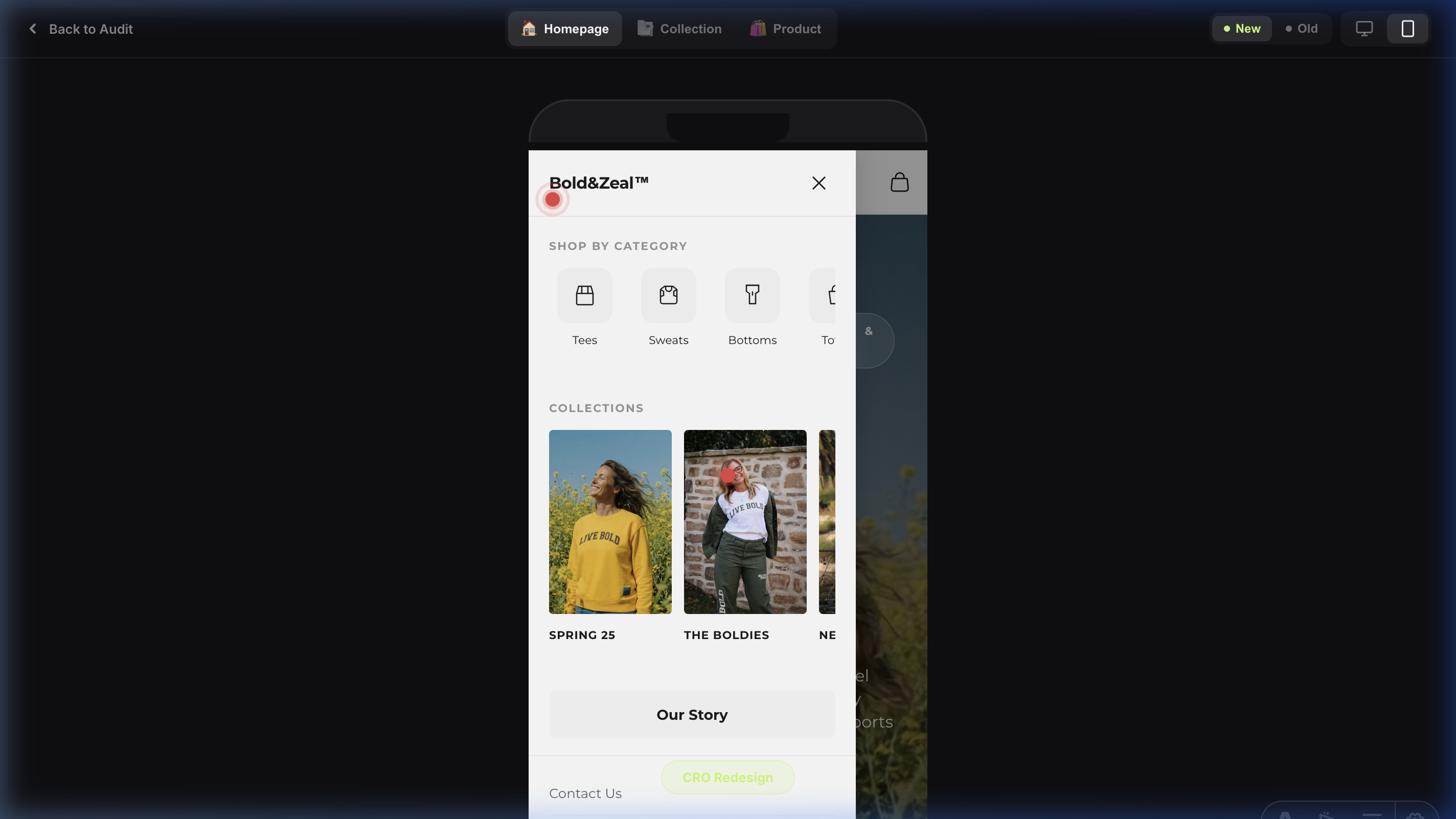
Icon-Driven Shop Menu — Guiding Users with Visual Category Cues

Issue: Text-Only Navigation Lacks Visual Differentiation.
Observation: The existing navigation relies exclusively on text labels to communicate product categories. When a user hovers over "Shop," they encounter a plain text list with no visual distinction between categories. All items look identical, requiring users to read every label before deciding where to click.
Impact: Text-only menus create higher Cognitive Load and slower decision-making. Research shows that icons paired with labels improve recognition speed by 20-30% compared to text alone (Nielsen Norman Group). Without visual anchors, users rely entirely on sequential reading, increasing Time to First Click in the navigation.
Recommendation: Implement a horizontal mega menu with category-specific icons alongside text labels. Each product type (Tees, Sweatshirts, Bottoms, Totes) should have a recognizable icon that provides an instant visual signal even before the label is read. This creates a scannable, recognition-based navigation pattern rather than a recall-based one.
Collection Showcase Menu — Visual Previews Drive Collection Discovery
Issue: Collections Are Hidden Behind Generic Text Links.
Observation: Currently, the only way for users to discover available collections is through plain text navigation links that offer zero preview of what lies behind them. "Spring Collection" and "Boldies" are abstract labels that provide no Information Scent — users cannot assess whether a collection is relevant to them without first clicking through.
Impact: Without visual previews, collection pages suffer from lower click-through rates. Users are less likely to explore collections when they cannot see what products or aesthetics await them. This represents missed cross-selling opportunities, particularly for seasonal and curated collections that rely on visual appeal to attract interest.
Recommendation: Implement a full-width mega menu for "Collections" featuring portrait-oriented product imagery for each collection. Each column should display a hero image from the collection, clearly labeled with the collection name and a direct link. This transforms navigation from a text-search task into a visual discovery experience, directly increasing collection page visits and reducing reliance on the homepage to surface collections.
Mobile Navigation Architecture — Thumb-Friendly Category Discovery
Mobile UX: -40% Interaction Cost, +15% discovery
Issue: Mobile Navigation Follows Desktop Convention (Hidden Accessibility).
Observation: The current mobile menu employs a conventional accordion-style list that buries categories behind multiple taps. Users must first open the hamburger, then tap a parent item, then scroll a long text list to find their desired category. This interaction pattern increases Interaction Cost on mobile where speed is paramount.
Impact: Each additional tap required to reach a product category results in approximately 20% user attrition. With categories hidden behind accordion folds, mobile users exhibit lower category exploration rates.
Recommendation: Implement a slide-out mobile drawer with pre-expanded horizontal scroll for both Shop categories (with icons) and Collections (with portrait imagery). Place hamburger on the left, center the logo, and show only the cart icon on the right for a balanced thumb-zone.
Sitewide
Bold Footer for a Bold Brand — Split-Color Logo as Visual Hook
Issue: Invisible Brand Exit — Generic Shopify Footer.
Observation: The original footer was a generic Shopify template with no distinctive brand presence. Users scrolled past it without any visual recognition or brand recall. For a brand called BOLD&ZEAL, the footer was anything but bold — it was forgettable.
Impact: Zero brand recall at the final touchpoint. The footer is the last thing a user sees before exiting. A weak footer means a weak last impression, directly undermining brand memorability and reducing the likelihood of return visits.
Recommendation: Implement an oversized BOLD&ZEAL wordmark spanning the full container width with a split-color treatment — the top half of the logo rendered in dark (matching the page background), and the bottom half in white (contrasting against the deep-black footer). This creates a cinematic 'reveal' effect as the user scrolls into the footer zone. Half black, half white — the contrast is impossible to miss and perfectly embodies the brand's bold identity.
Structured Footer Grid — Removing Shopify Clutter
Issue: Footer Overloaded with Redundant Shopify Widgets.
Observation: The original footer was cluttered with unnecessary Shopify-default elements: a 'Follow on Shop' button that served no conversion purpose, a subscribe form that duplicated the newsletter section directly above it, an out-of-place 'Our Purpose' block, and only 3 generic links (Search, Privacy Policy, FAQ). The footer felt unbalanced and unfocused.
Impact: Users reaching the footer hit a dead end with no clear path back into the product catalog. The redundant widgets added visual noise, increased cognitive load, and inflated the footer's height without adding value — directly increasing exit rates.
Recommendation: Strip all unnecessary Shopify clutter and replace with a clean, balanced 4-column grid: Brand Story with social icons, Shop links mirroring the header navigation, Company links, and Support links. Every column serves a purpose. Every link offers a re-entry point into the conversion funnel. The result is a footer that feels intentional, professional, and structurally sound.
Secondary Footer Bar — Legal Trust & Payment Confidence
Issue: Missing Legal Foundation and Payment Trust Signals.
Observation: The original footer had no dedicated secondary bar for legal information. Copyright was minimal, legal links were buried in the main footer body, and payment method badges were either absent or not visually grouped. This is a common oversight in Shopify stores that erodes trust for first-time visitors.
Impact: Weakens perceived legitimacy, especially for traffic from paid ads. First-time visitors from Meta or Google Ads evaluate trustworthiness before committing to a purchase. Missing legal structure and payment badges create subconscious friction that reduces purchase confidence.
Recommendation: Add a clean, visually separated secondary footer bar with copyright information, structured legal navigation links (Privacy Policy, Terms of Service, Refund Policy), and recognizable payment method badges (Visa, Mastercard, Apple Pay, Google Pay). This micro-detail signals professionalism and reduces purchase anxiety for cautious, first-time buyers.
SEO & AI Visibility
| Category | Status | Description | Recommendation |
|---|---|---|---|
| — | |||
| — | |||
| — |
Sitespeed / Performance
Detailed Lighthouse performance analysis for key page templates.
Homepage
Mobile
Desktop
Collection (PLP)
Mobile
Desktop
Product (PDP)
Mobile
Desktop
LCP Breakdown
Load Delay is the biggest bottleneck (52%).
Main Thread Blocking
Style & Layout is causing major freezes.
Top Technical Savings
Quick Wins / AB Test Ideas
Left-Align & Soften Text Walls
Remove 'Add Order Note' Distraction
Replace Abstract Trust with Concrete Guarantees
A/B Testing Roadmap STRATEGY
Flat Lay vs. Lifestyle Grid Images
Hypothesis: The current dense lifestyle backgrounds in the mobile PLP grid create high cognitive load. Testing clean, studio-lit flat lays as the primary image (keeping lifestyle for PDP/hover) will increase visual processing speed and PLP-to-PDP click-through rates by up to 15%.
Sticky Filter Bar vs. Static
Hypothesis: Users who filter convert at a 3x higher rate. Making the Filter/Sort utility bar 'sticky' (following the user down the scroll) rather than static at the top will increase interaction with the catalog and reduce overall bounce rate.
Implementation
Tier 1: Included Quick Wins (Foundational)
- Strategic AI Visibility Jumpstart: Schema implementation roadmap to ensure ChatGPT and Perplexity correctly index your products.
- Technical SEO Remediation: Resolves 6 critical architectural issues preventing optimal organic crawl depth.
- LCP Asset Prioritization Protocol: Re-routing browser render cues (
fetchpriority) to force the main hero image to load instantly, bypassing standard queueing. - Mobile Viewport Normalization: Injecting scaling safeguards to prevent the native iOS Safari input-zoom bug that breaks layout during search or checkout.
- Frictionless UX Quick Wins: Immediate CSS injection to fix text halation, contrast violations, and microscopic tap targets.
- Checkout Distraction Removal: Surgical removal of proven cognitive-load triggers (e.g., 'Add Note' field).
- Expert CRO Review Session: A 30-minute consultation going over the audit to lock in a prioritized roadmap.
Timeline: 1-2 Weeks
Price: Included in Audit Scope
Tier 2: Core Conversion Pack (Recommended)
- Everything in Tier 1
- Full UI/UX overhaul of the Product Detail Page (CTA Hierarchy, Swipe Affordances, Trust Blocks)
- Cart Drawer Gamification (Dynamic Free Shipping Bar, automated In-Cart Cross-Sells)
- Collection Page utility sticky bar and Fitts's Law touch-target expansion
Timeline: 2-3 Weeks
Price: $4,000
Tier 3: Full Stack Performance Pack
- Everything in Tier 1 & 2
- Deep Site-Speed & Core Web Vitals optimization (targeting sub-2.5s LCP)
- Full WCAG Accessibility contrast compliance refactoring
- Setup and execution of the first 2 A/B Tests from the testing roadmap
Timeline: 3-4 Weeks
Price: $6,000